Quick Start Guide
Sling offers a lot of flexibility. Whether you want to go fast and quickly see the final result,
or would rather dive deeper into the product, we got you covered.
👇 Let's get started!
🚀 Step 1: Create a new project with Sling
                              # with Yarn
                              yarn create sling-app


                              # with NPM
                              npx create-sling-app
Step 2: Set the license key and email
Once the download is complete, you will be prompted to enter the license key and email.
Sling community is free forever. This is required to manage frontend from the Sling Studio.
                     ?
                     Your email address?
                     > cto@awesomecompany.com
Next your unique Sling license Key which can be easily generated once
after signing up on the Studio.
                     ?
                     Your Sling License Key?
                     >
                     195b2d33-b996-471b-90c6-d4cdde525
If not prompted with Sling Api Key and Email? You can set up the same in your environment
files.
                     .env
                     NEXT_PUBLIC_GET_INIT_PROPS=https://sling.biz/api/v1/frontend/getInitProps
                     NEXT_PUBLIC_CLIENT_KEY_SECRET=your-sling-secret-key
                     NEXT_PUBLIC_CLIENT_ID=your@email.id
Once the installation is complete, Visit the below URL on your local to view your Sling Frontend
App .
http://localhost:4087
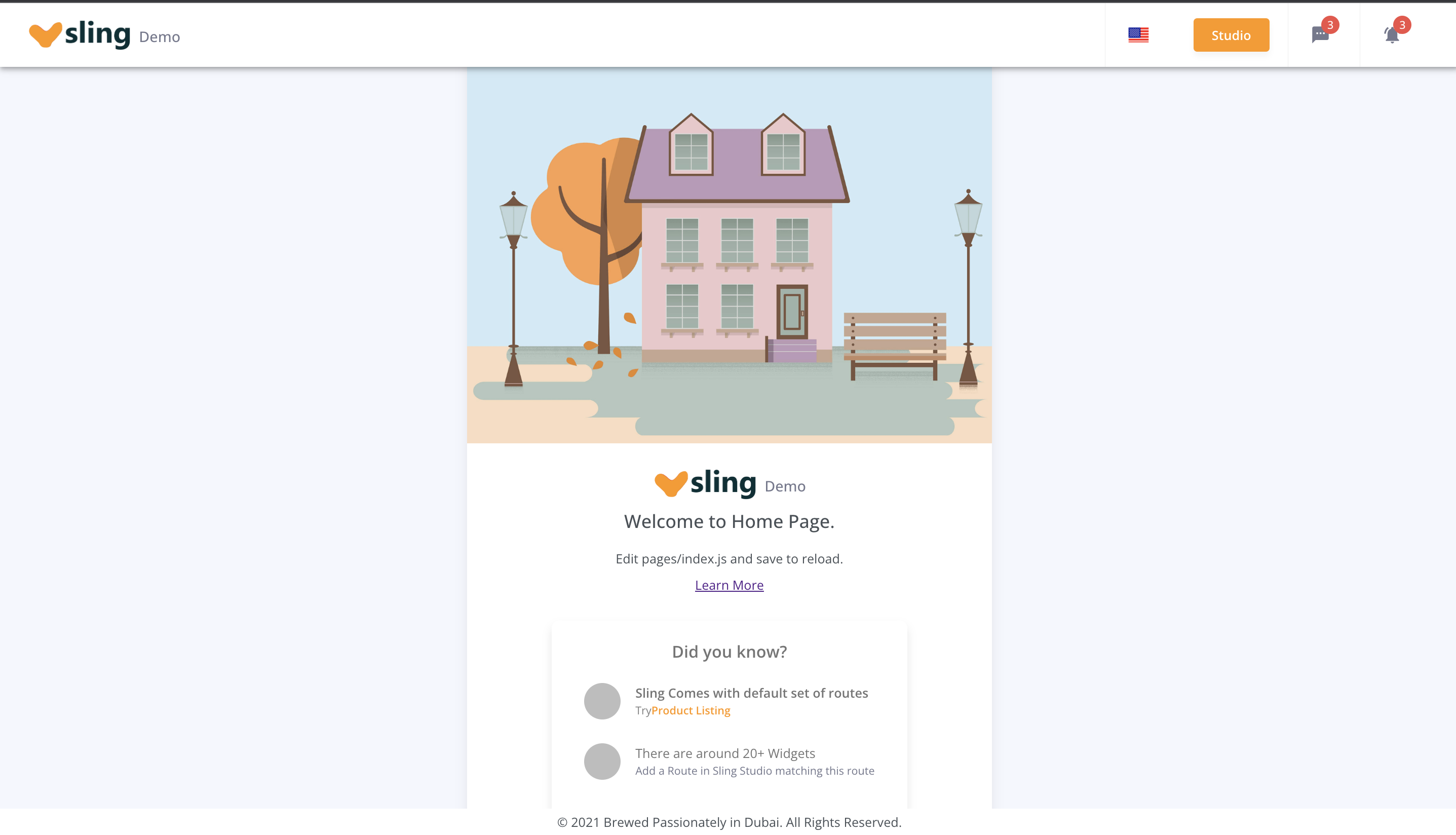
You should see a functioning demo frontend.
Home Page
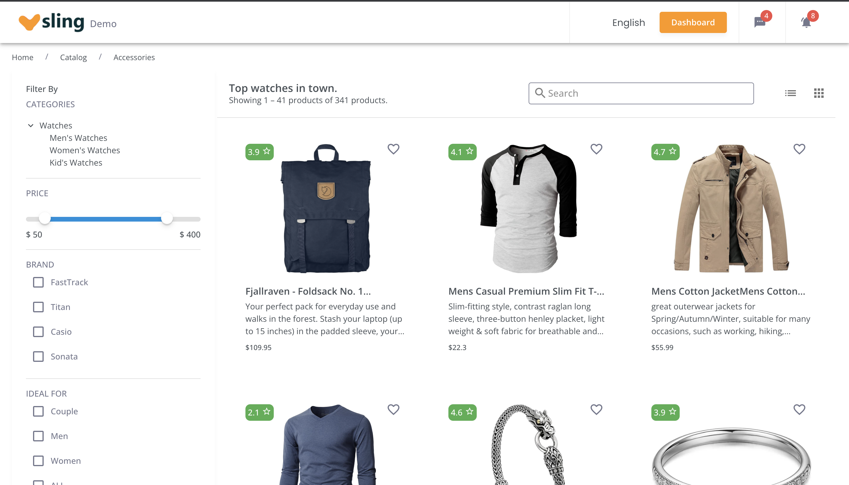
For Product Listing Page, You can visit /dubai/women/clothes/products
Step 3: Manage Frontend with Sling Studio
Login to Sling Studio and manage your layout,
css and customize your frontend site on the fly.
For any queries, Please contact contact our support
team.
Enterprise
Sling Enterprise is a commercial offering from the Sling core team built
on top of the open-source product.
It's goal is to give you all the tools you need to launch your Frontend Website
and provide you with ready-to-use integrations
that will reduce your project's development time and cost.
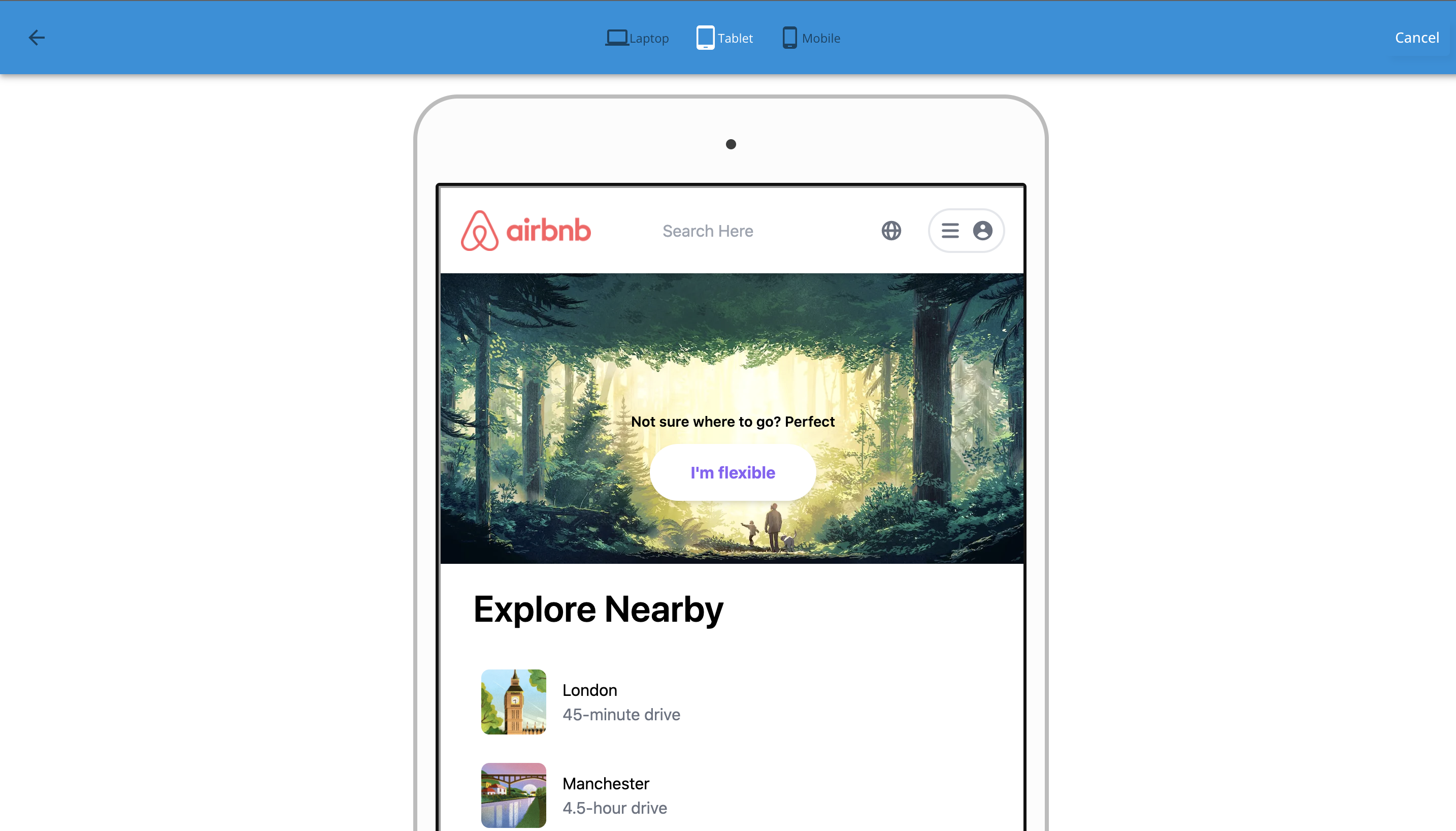
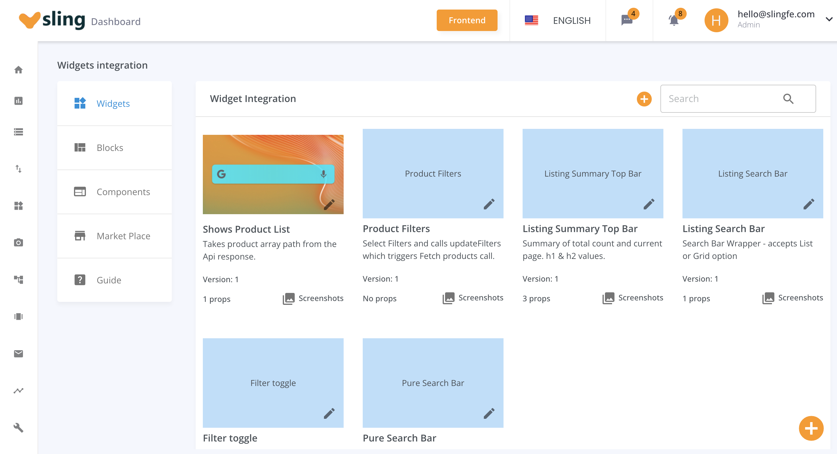
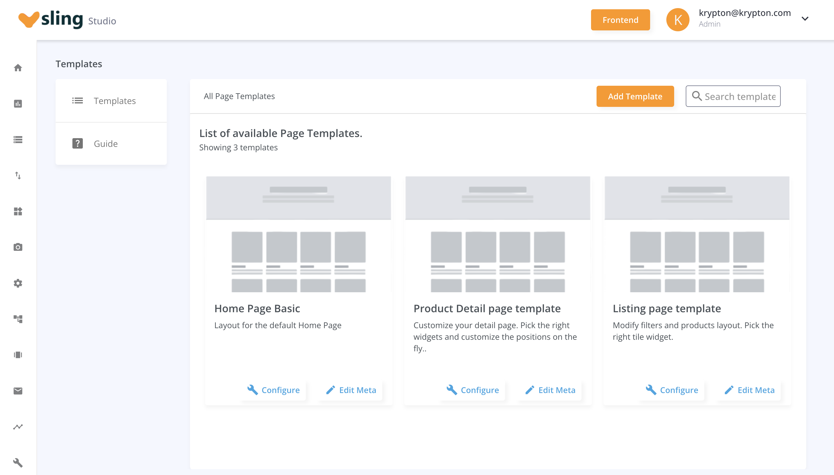
Sample Screenshots
The screenshots below are taken from Sling Studio.
Differences between Open Source and Enterprise versions
- Access to all the Flavors, Page Templates & Widgets
- Access to cloud and managed services
- Unlimited usage for other tools - Manage Analytics and 3rd party apps.
Use Cases
Manage your Static Pages.
-
Frequent updates on your Static and Marketing pages can be
productivity killer. Instead, Sling can come very handy in updating content on the
fly
from the Studio. Use Page Templates to create blueprint of your static pages and
create
as many Page Routes (Actual URLs) by over-riding the defaults.
-
Modify Banners, In-Page Filters and Recommendations on your Product Listing & Detail
Pages on the Fly without deploying any code.
-
Create Page Templates for Listing and Detail pages and customize the Banners run
time from Sling Studio for category and product pages.
-
Ready to use Widgets and Components
-
Browse marketplace to buy ready to use widgets for your website or ecommerce
storefront.
-
Quick launch your WebSite or Ecommerce Store.
-
Sling comes with ready to use customizable Material UI theme and bootstrapped NextJS
code. This can be used to create any kind of website quickly. Example use cases can
be - A Real Estate Property search platform, a Used Car web portal, and advanced
Blog or an
Ecommerce webapp.
-
Key Concepts
Sling has 2 components -
- A Frontend client in NextJS
- Sling Studio
The Frontend client uses the Page Layout & UI Configuration from the Sling Studio to render the UI
with the relevant React Widgets.
Sling Studio can be used to pass dynamic configurable props from the Studio to the Frontend Client.
Page Templates
Page Templates are like blue prints of an actual page.
They allow you to add a React Widget on the Page and adjust its position using CSS Grid Layout.
You should see a list of all page templates you create in templates section.

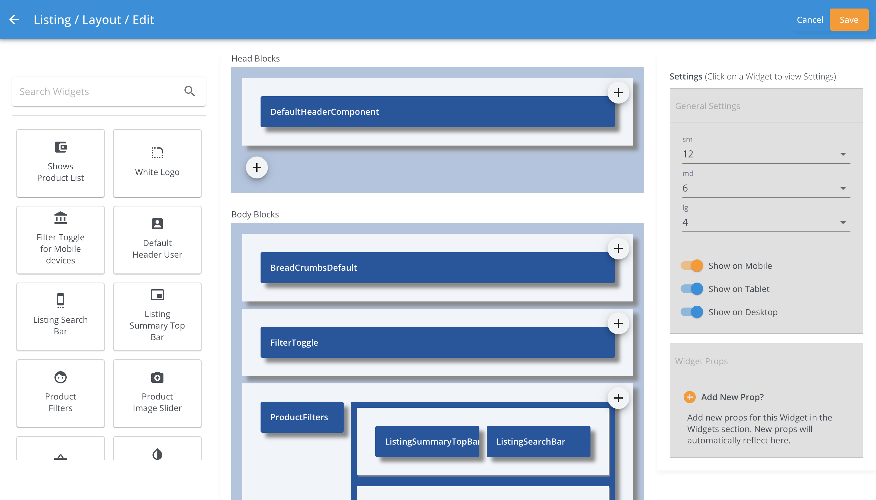
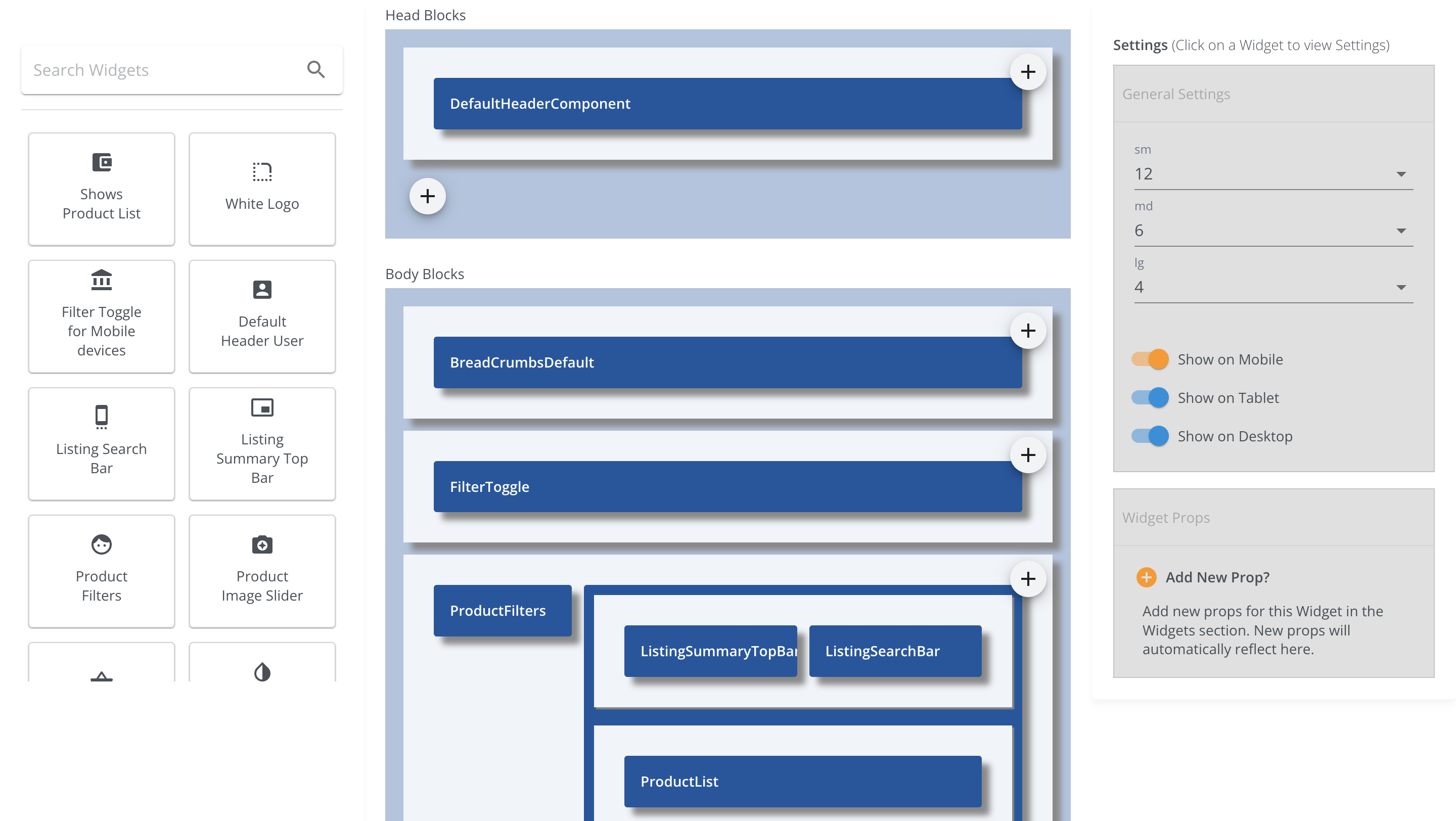
A blue print of a page in the template looks like the image below.
Below example, shows how a Product List Template looks like.
This template has 3 sections header, body and footer with list of below mentioned
React Widget components aligned as per their Grid Widths.
- Head
- Body
- BreadCrumbs
- Filter Toggle Component
- Product Filters
- Product List Summary
- Product Search Bar
- Product Grid
- Footer
Screenshot of Product Listing Page Template.

Page Props
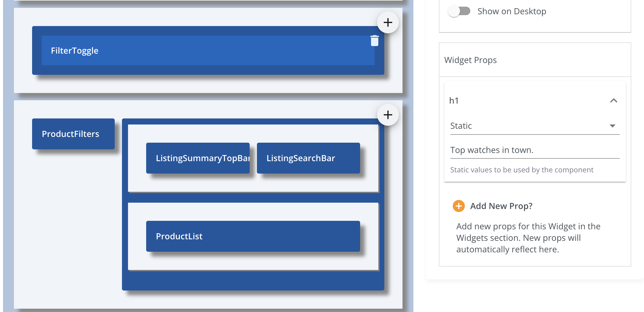
Click on a Widget in the Edit Page Template to view list of available props.
You can add any number of Sling Props for any Widget from the Widgets section.
Once added, the new props will reflect automatically in this section.
Please refer the image below.

Route URLs
-
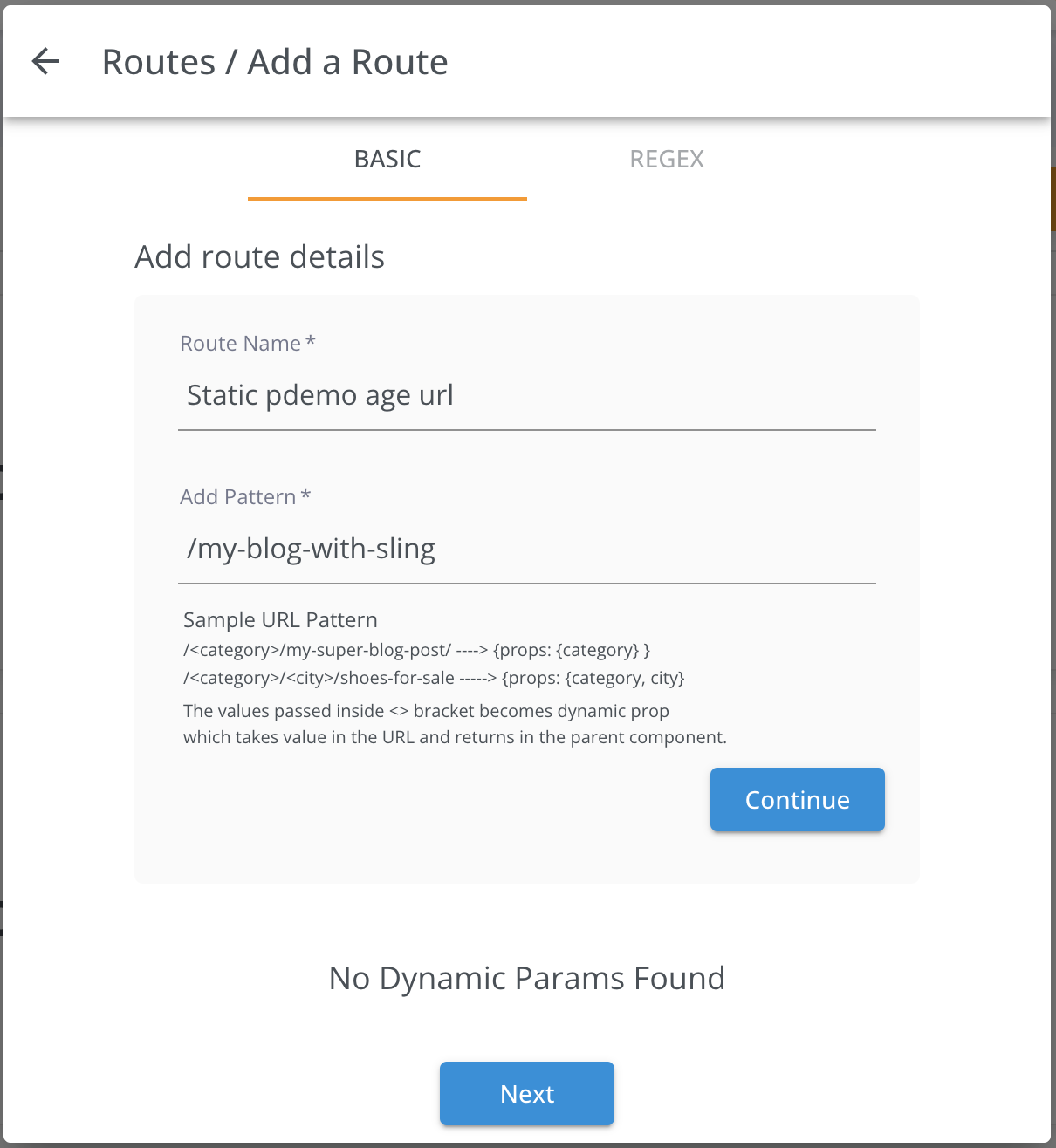
Sling Routes are URLs that you can be created using any page template.
A new URL route can either be a Static or a Dynamic URL.
Please refer sample screenshot below

-
To add a Dynamic URL Route, Use <> brackets to make a route path dynamic prop
variable
For example, In the URL Route below, city, liCategory and
l2Category
are the dynamic props.
/<city>/<l1Category>/<l2Category>/products
Below URLs will match the above Route pattern:
/dubai/women/clothing/products

 /pariah/shoes/puma/products

 /london/fashion-week/westminster/products
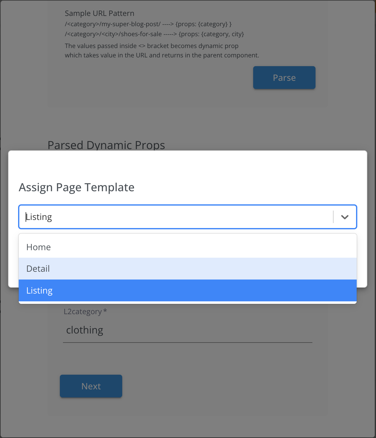
Every URL route needs to have a Page Template. You can assign any page template to a
route by
Editing the Route.

-
Override Template Props
- Page Template assigned to each route has set of widget props.
These are the default props for every page route that uses it. To override these
props, Configure the assigned page template in the routes section/
Refer screenshot below

Widgets, Blocks & Components
Every page in Sling is made up of smaller React components called Widgets.
Widgets can be combined to form larger Blocks, and a Component is a collection of blocks and widgets.
Widgets provide flexibility to control different parts of the UI by passing props dynamically, making them customizable and reusable across different templates.
Widget Types
There are different types of widgets available based on the type of data they consume or how their props are defined. Below are the key widget types:
-
Static Widgets:
These widgets use predefined static values for their properties. For example, labels or static text like a heading (`h1`). The value does not change dynamically.
{"name": "h1", "propType": "static", "value": "Top watches in town."}
-
Response-Derived Widgets:
These widgets derive their values from an external API response. They rely on the `responsePath` to map data from the API to the widget properties.
{"name": "responsePath", "propType": "response-derived", "value": "data.products"}
-
Static-Derived Widgets:
These are hybrid widgets that use static values derived from logic or concatenation with other values. For example, you can concatenate static strings and dynamic data to form labels.
                                 {"name": "h2", "propType": "static-derived", "value": "Showing 1 – 41 products of

                                 products."}
-
Option Widgets:
These widgets provide a predefined set of options, which are typically used for dropdowns or selection inputs. For example, a widget may allow users to select between "List" or "Grid" view.
{"name": "viewType", "propType": "static", "dataType": "option", "options": [{"value": 1, "label": "List"}, {"value": 2, "label": "Grid"}]}
Widget Structure
The following is a structured representation of a typical widget in Sling:
                {
                  "name": "Product List",
                  "key": "ProductList",
                  "type": "block",
                  "icon": "account_balance_wallet",
                  "description": "Displays a list of products fetched from the API.",
                  "ownership": "public",
                  "props": [
                    {
                      "name": "responsePath",
                      "propType": "response-derived",
                      "dataType": "string",
                      "default": "data.products"
                    },
                    {
                      "name": "h1",
                      "propType": "static",
                      "dataType": "string",
                      "default": "Top products in store"
                    }
                  ],
                  "component": "ProductListComponent",
                  "availableToAllPages": true
                }
Widget Attributes
- Name: A human-readable name for the widget.
- Key: A unique identifier used to register the widget.
- Type: The type of widget, which could be a "widget", "block", or "component".
- Icon: The icon used to represent the widget in the UI.
- Description: A short description explaining the widget's functionality.
- Ownership: Specifies if the widget is "public" or "private".
- Props: A list of properties (props) passed to the widget. These props can be of different types (static, response-derived, static-derived, or options).
- Component: The React component that renders the widget.
- Available to All Pages: Specifies if this widget can be used across all pages.
Props Structure
Each widget contains props that determine its behavior. These props can be of the following types:
- Static: Predefined values (e.g., labels, text).
- Response-Derived: Values derived from an API response using a path in the response object.
- Static-Derived: Values derived by applying logic to static values (e.g., string concatenation).
- Options: A set of predefined options (e.g., dropdowns, select inputs).
By defining widgets this way, Sling allows for highly customizable pages and layouts, while ensuring consistency and reusability across different parts of the site.
Registering a Widget
You can register your custom widgets using the registerWidget method. This allows you to add widgets dynamically and ensures they are available throughout your project. Here’s how to register a widget:
                import { registerWidget } from "./widgetRegistry";
                import ProductListComponent from "./components/ProductListComponent";

                // Define widget options
                const widgetOptions = {
                    description: "Displays a list of products from the API.",
                    ownership: "public",
                    key: "ProductList",
                    icon: "account_balance_wallet",
                    props: [
                        {
                            name: "responsePath",
                            propType: "response-derived",
                            dataType: "string",
                            default: "data.products"
                        },
                        {
                            name: "h1",
                            propType: "static",
                            dataType: "string",
                            default: "Top products in store"
                        }
                    ],
                    availableToAllPages: true,
                    type: "block"  // Can be "widget", "block", or "component"
                };

                // Register the widget
                registerWidget("Product List", ProductListComponent, widgetOptions);
The registerWidget function takes three arguments:
- Name: A human-readable name for the widget.
- Component: The React component that implements the widget.
- Options: An object containing widget properties such as description, props, ownership, and other metadata.
Once registered, the widget will be available in the widget registry and can be used across pages or templates based on the configuration provided.
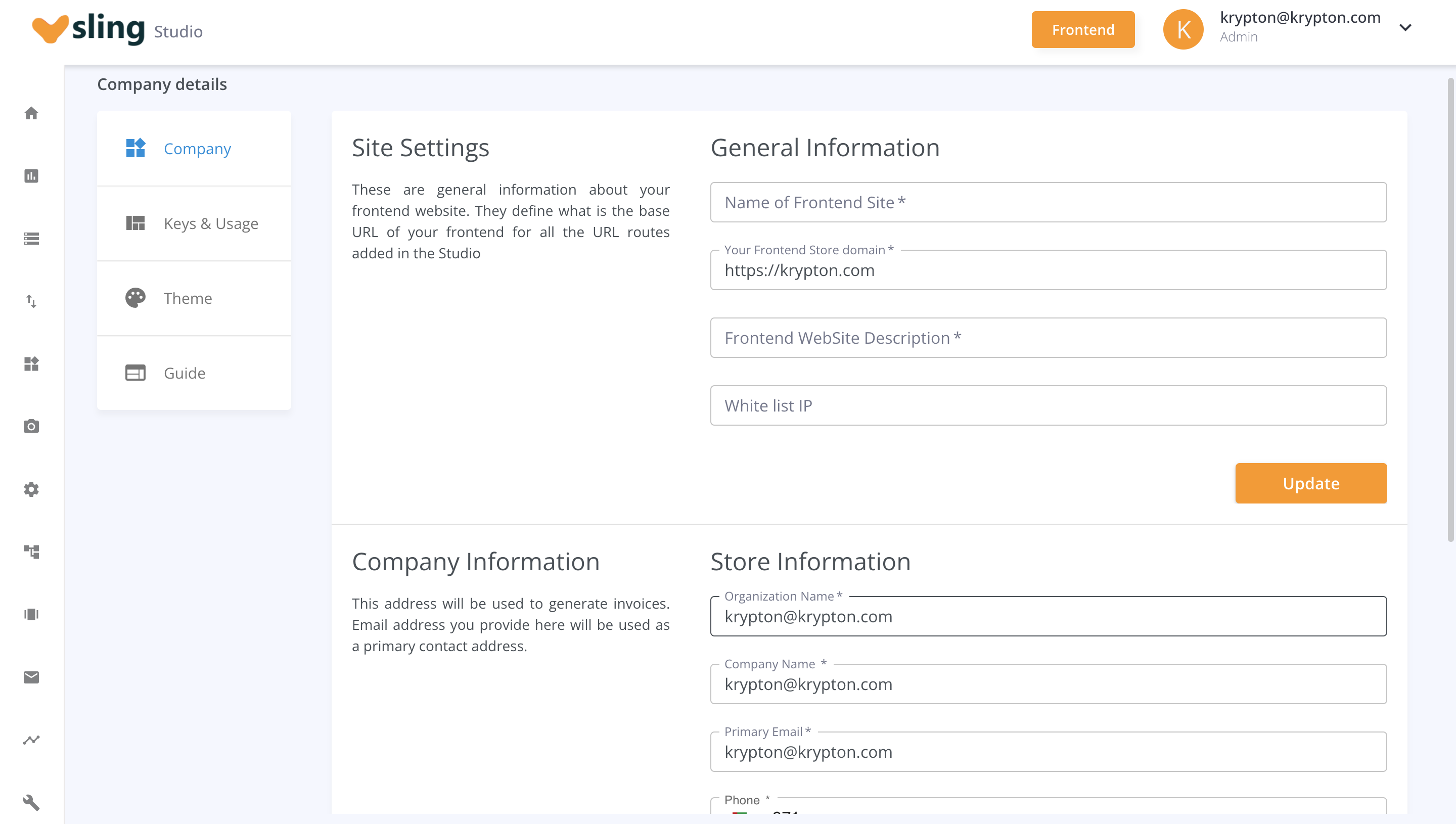
Settings & Theme
Manage and Update your Company information, Frontend Domain and Theme
Settings like Spacing, CSS and Color.

API Reference
This section provides detailed descriptions of the core API methods in Sling, starting with the Widget Registry APIs. These functions can be imported from the sling-core npm module and used directly in your project.
The registerWidget method allows you to add a custom widget to the Sling widget registry, making it available in Sling’s Studio for dynamic frontend rendering.
Example Usage
            import { registerWidget } from 'sling-core';
            import MyCustomComponent from './MyCustomComponent';

            registerWidget('CustomWidget', MyCustomComponent, {
                key: 'CustomWidget',
                description: 'This widget displays custom data.',
                ownership: 'public',
                props: [
                    {
                        name: 'responsePath',
                        propType: 'response-derived',
                        dataType: 'string',
                        default: 'data.results'
                    },
                    {
                        name: 'h1',
                        propType: 'static',
                        dataType: 'string',
                        default: 'Custom Title'
                    }
                ],
                availableToAllPages: true,
                type: 'block'
            });
Example Output
            {
              "name": "CustomWidget",
              "key": "CustomWidget",
              "description": "This widget displays custom data.",
              "type": "block",
              "props": [
                {
                  "name": "responsePath",
                  "propType": "response-derived",
                  "dataType": "string",
                  "default": "data.results"
                },
                {
                  "name": "h1",
                  "propType": "static",
                  "dataType": "string",
                  "default": "Custom Title"
                }
              ]
            }
The initializeWidgetRegistry function is responsible for loading widgets into memory from the backend or from the local cache when running in a browser environment. It ensures that all widgets are available for use in Sling Studio.
Example Usage
            import { initializeWidgetRegistry } from 'sling-core';

            initializeWidgetRegistry()
                .then(() => {
                    console.log('Widget registry initialized.');
                })
                .catch((error) => {
                    console.error('Error initializing widget registry:', error);
                });
The getAllWidgets method retrieves all widgets currently registered in the widgetRegistry. Optionally, it can filter widgets by their type (widget, block, or component).
Example Usage
            import { getAllWidgets } from 'sling-core';

            const widgets = getAllWidgets();
            console.log('All registered widgets:', widgets);
The setWidgets function allows you to manually populate the widget registry with an array of widgets fetched from the database or another source.
Example Usage
            import { setWidgets } from 'sling-core';

            const widgets = [
                { key: 'CustomWidget1', ... },
                { key: 'CustomWidget2', ... }
            ];

            setWidgets(widgets);
            console.log('Widgets have been set.');
RenderTree
The RenderTree method is a key part of Sling’s architecture, responsible for rendering the entire page structure based on the page templates created in Sling Studio. It dynamically attaches local widget code from your registry to the template and renders the page, making the frontend interactive and customizable.
Typically, users define a page template in Sling Studio and attach it to a Page Route (URL for the page). During server-side rendering (SSR), the page layout is automatically included in the initial rendering phase and passed to the global routes.
The RenderTree method then works its magic by pulling in all the widgets from the registry, attaching the corresponding local widget code, and rendering the entire page structure as defined in the layout. This powerful mechanism allows Sling to provide a flexible and dynamic frontend framework.
Example Usage
import React from 'react';
import {useSelector} from 'react-redux';
import Box from '@material-ui/core/Box';
import {makeStyles} from '@material-ui/core/styles';
import {RenderTree} from 'sling-core';
import ErrorSling from '../ErrorSling';

const GlobalPage = () => {
  const classes = useStyles();
  const layoutInitial = useSelector(({layout}) => layout);
  const {layoutConfig, pageTemplate} = layoutInitial;
  const layout = layoutConfig[pageTemplate];

  if (!layout) {
    return <ErrorSling statusCode={404} >;
  }

  return (
    <Box className={classes.appMain}>
      <Box className={classes.bodyMain}>
        <RenderTree
          layout={layout}
        />
      </Box>
    </Box>
  );
};

export default GlobalPage;
Basics
Sling FE Client is customized NEXTJs web app.
The default version uses getInitialProps() in _app.js to fetch initial
config and layout for every route change.
This will make every page render on the server side.
_app.js has multiple Context Providers for Theme Settings, Layout
Configuration,
Route Constants, Language, Sling Provider and Api Response.
Global Route Handler
- Sling Fe uses NextJs's 3 dot file syntax
[...global].jsto capture all the
routes.
Refer NextJs Dynamic
Routes
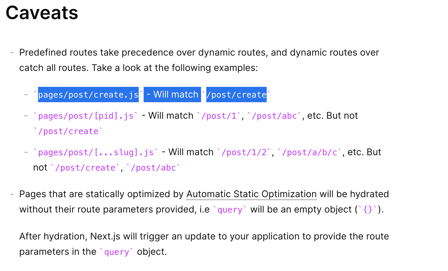
- Predefined routes take precedence over dynamic routes, and dynamic routes over catch all
routes. Take a look at the following examples:
pages/post/create.js - Will match /post/create even if a global
handler is present.
Please Refer screenshot from NextJS official documentation.

SSR
By Default NextJs supports server side rendering.
The default version of Sling uses getInitialProps() inside _app.js
which forces every route change to fetch from the server.
But this can be changed by using the pro version or by moving getInitialProps()
from _app.js to custom pages.
Head for Headless
Sling FE offers the Frontend Client for connecting any of your backend APIs.
You can use your own custom APIs to connect in built components or create your own using
Strapi and connect to Sling Studio.
-
Any Api calls for your Pages can be added directly inside the HOC or the wrapping Sling
Component / Block or Widget.
-
API calls can also be managed from the Sling Studio in the API's section.
The Api Section provides an option to add a list of API Endpoints which can be attached to
any widget props.
-
Any API calls added from the Sling Studio are prefeched in the Sling Studio and are returned
in the
getInitialProps() initial API call.
Customizing Pages & Routes
Sling uses global handler [...global].js to find all matching routes. To create a custom route
which does not use Sling you can just create your page route and NextJS will make sure the
static file route you created gets the priority.
Custom Cache
The Sling FE is dependent on Sling Studio for fetching the initial layout and theme settings.
This adds a bit of latency in the frontend website. To avoid this, you can specify your own
custom CDN path for the static JSON files.
Section Item 9.1 (FAQ Category One)
What's sit amet quam eget lacinia?
Lorem ipsum dolor sit amet, consectetuer adipiscing elit. Aenean commodo ligula eget dolor.
Aenean massa. Cum sociis natoque penatibus et magnis dis parturient montes, nascetur ridiculus
mus. Donec quam
felis, ultricies nec, pellentesque eu, pretium quis, sem. Nulla consequat massa quis enim. Donec
pede justo, fringilla vel, aliquet nec, vulputate eget, arcu. In enim justo, rhoncus ut,
imperdiet a, venenatis
vitae, justo. Nullam dictum felis eu pede mollis pretium.
How to ipsum dolor sit amet quam tortor?
Donec sodales sagittis magna. Sed consequat, leo eget bibendum sodales, augue velit cursus nunc,
quis gravida magna mi a libero. Fusce vulputate eleifend sapien. Vestibulum purus quam,
scelerisque ut, mollis
sed, nonummy id, metus. Nullam accumsan lorem in dui.
Can I bibendum sodales?
Fusce vulputate eleifend sapien. Vestibulum purus quam, scelerisque ut, mollis sed, nonummy id,
metus. Nullam accumsan lorem in dui.
Where arcu sed urna gravida?
Aenean et sodales nisi, vel efficitur sapien. Quisque molestie diam libero, et elementum diam
mollis ac. In dignissim aliquam est eget ullamcorper. Sed id sodales tortor, eu finibus leo.
Vivamus dapibus
sollicitudin justo vel fermentum. Curabitur nec arcu sed urna gravida lobortis. Donec lectus
est, imperdiet eu viverra viverra, ultricies nec urna.
Section Item 9.2 (FAQ Category Two)
What's sit amet quam eget lacinia?
Lorem ipsum dolor sit amet, consectetuer adipiscing elit. Aenean commodo ligula eget dolor.
Aenean massa. Cum sociis natoque penatibus et magnis dis parturient montes, nascetur ridiculus
mus. Donec quam
felis, ultricies nec, pellentesque eu, pretium quis, sem. Nulla consequat massa quis enim. Donec
pede justo, fringilla vel, aliquet nec, vulputate eget, arcu. In enim justo, rhoncus ut,
imperdiet a, venenatis
vitae, justo. Nullam dictum felis eu pede mollis pretium.
How to ipsum dolor sit amet quam tortor?
Donec sodales sagittis magna. Sed consequat, leo eget bibendum sodales, augue velit cursus nunc,
quis gravida magna mi a libero. Fusce vulputate eleifend sapien. Vestibulum purus quam,
scelerisque ut, mollis
sed, nonummy id, metus. Nullam accumsan lorem in dui.
Can I bibendum sodales?
Fusce vulputate eleifend sapien. Vestibulum purus quam, scelerisque ut, mollis sed, nonummy id,
metus. Nullam accumsan lorem in dui.
Where arcu sed urna gravida?
Aenean et sodales nisi, vel efficitur sapien. Quisque molestie diam libero, et elementum diam
mollis ac. In dignissim aliquam est eget ullamcorper. Sed id sodales tortor, eu finibus leo.
Vivamus dapibus
sollicitudin justo vel fermentum. Curabitur nec arcu sed urna gravida lobortis. Donec lectus
est, imperdiet eu viverra viverra, ultricies nec urna.
Section Item 9.3 (FAQ Category Three)
How to dapibus sollicitudin justo vel
fermentum?
Donec sodales sagittis magna. Sed consequat, leo eget bibendum sodales, augue velit cursus nunc,
quis gravida magna mi a libero. Fusce vulputate eleifend sapien. Vestibulum purus quam,
scelerisque ut, mollis
sed, nonummy id, metus. Nullam accumsan lorem in dui.
How long bibendum sodales?
Fusce vulputate eleifend sapien. Vestibulum purus quam, scelerisque ut, mollis sed, nonummy id,
metus. Nullam accumsan lorem in dui.
Where dapibus sollicitudin?
Aenean et sodales nisi, vel efficitur sapien. Quisque molestie diam libero, et elementum diam
mollis ac. In dignissim aliquam est eget ullamcorper. Sed id sodales tortor, eu finibus leo.
Vivamus dapibus
sollicitudin justo vel fermentum. Curabitur nec arcu sed urna gravida lobortis. Donec lectus
est, imperdiet eu viverra viverra, ultricies nec urna.
